

Designing Visual Information
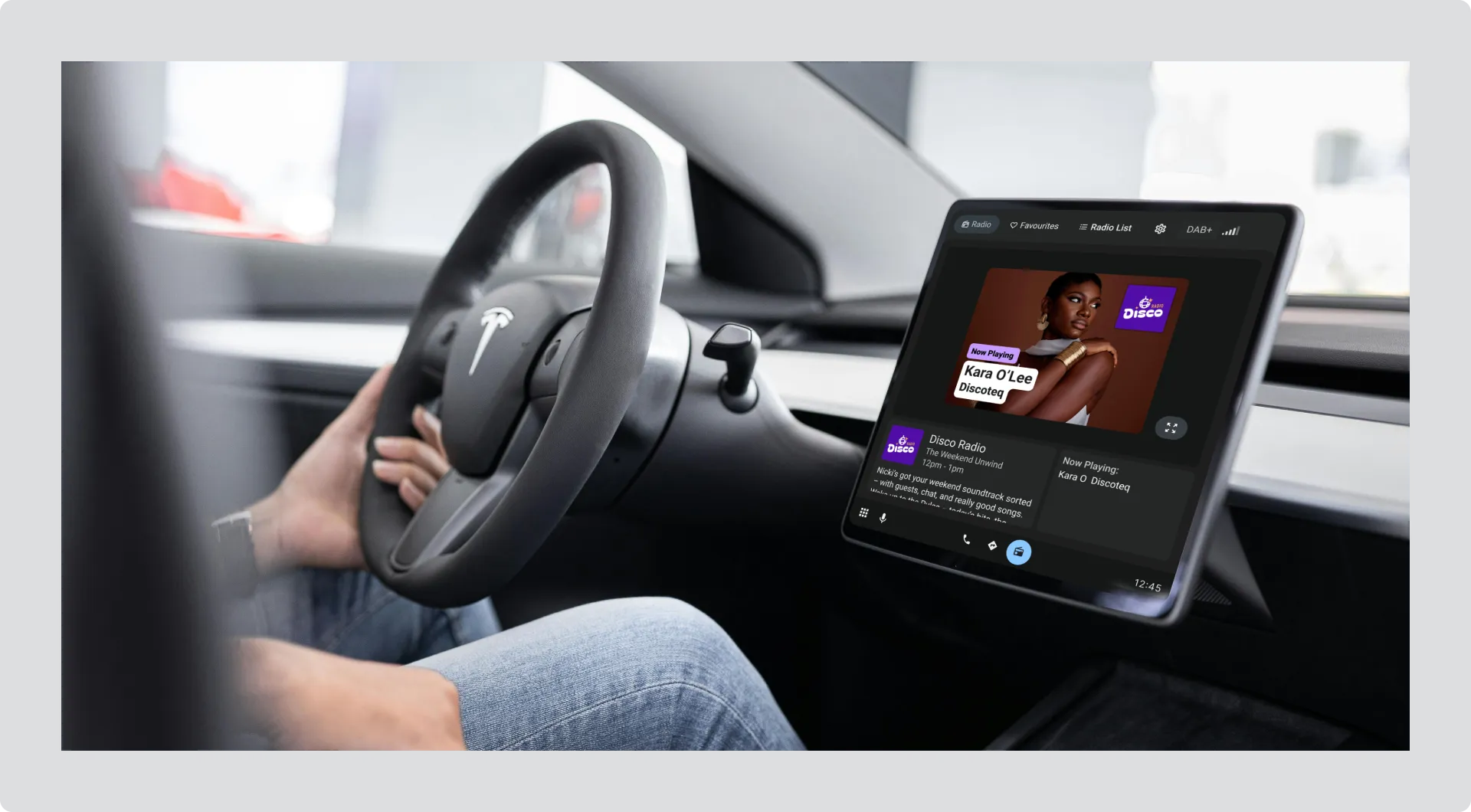
Visual information can include track images, programme images, presenter photos, or promotional content. Whatever you create, it needs to be instantly readable while someone is driving.
Design for legibility
Section titled “Design for legibility”Visual information appears on screens while drivers are focused on the road. They need to understand what they’re seeing in a quick glance.
Understanding contrast ratio
Section titled “Understanding contrast ratio”Contrast ratio measures the difference in brightness between text (or icons) and its background. A higher ratio means text is easier to read at a glance.
- Minimum contrast ratio: 4.5:1 for all text and icons
- Preferred contrast ratio: 7:1 for the most important information
Use a contrast checker tool like colorcontrast.app to verify your designs. Simply enter your text color and background color, and the tool will tell you if it meets requirements.
Avoid glare:
Don’t use pure white (#FFFFFF) for text, backgrounds, or large areas. Pure white creates glare in vehicle cabins, especially in low-light conditions. Instead, use light greys like #E6E6E6 for light-colored text and elements.
Choose the right background approach
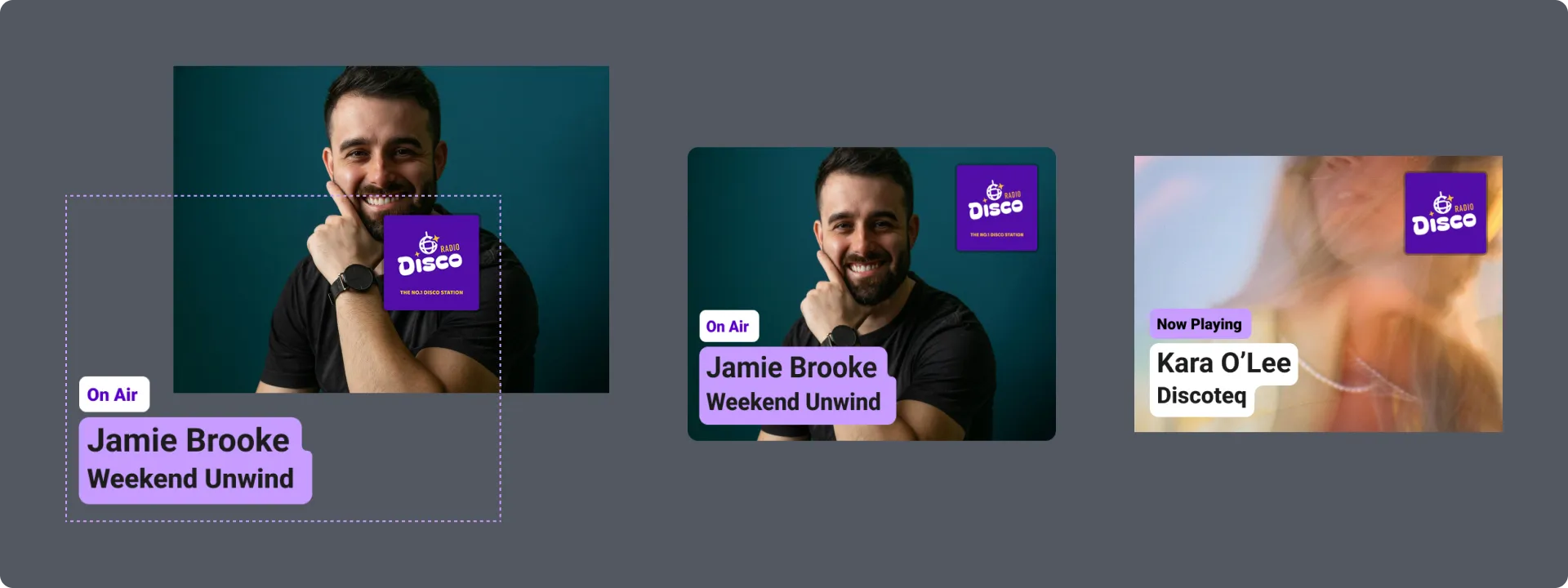
Section titled “Choose the right background approach”Image showing three background treatments:
Good: Solid background
Text on a solid color background provides the clearest, most reliable contrast. This is the safest approach for ensuring text remains legible.
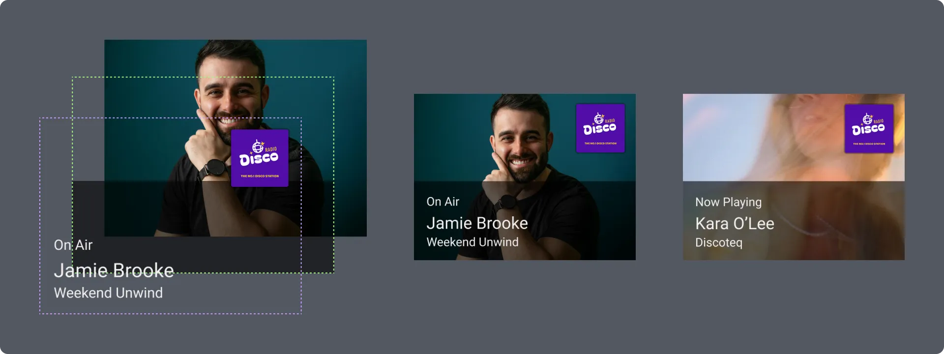
Good: Text background panel
Adding a semi-transparent panel (typically 40-60% opacity) behind text creates clear separation from photographic backgrounds while maintaining contrast.
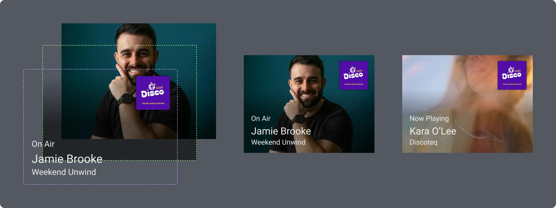
Good: Gradient background
Subtle gradients can work well if they maintain sufficient contrast with all text. Test that contrast remains above 4.5:1 across the entire gradient.
Examples of visual information
Section titled “Examples of visual information”Good examples of Visual Information:**
Section titled “Good examples of Visual Information:**”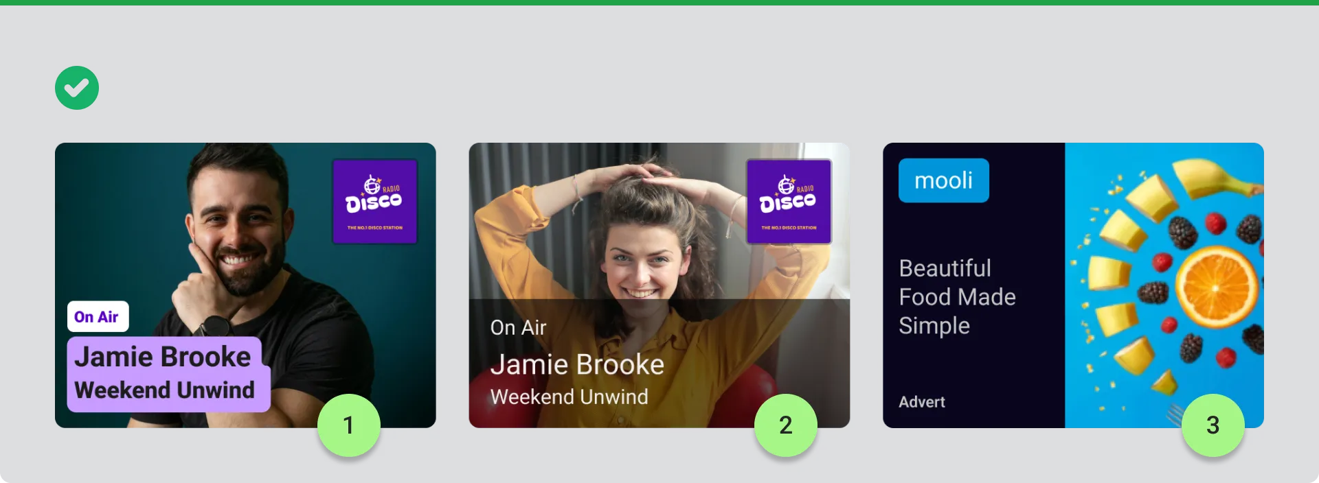
-
Presenter image with clear text panel
Text sits on a solid background, creating strong separation from the photograph. Presenter name and programme title are easy to read. -
Presenter image with sufficient contrast
Semi-transparent dark panel at 60% opacity provides enough contrast for white text to remain readable against the lighter background. -
Advertisement with clear hierarchy
Brand name and short headline are prominently displayed. The split layout keeps text on a solid background while showing the product image clearly.
Bad examples and what to avoid in Visual Information
Section titled “Bad examples and what to avoid in Visual Information”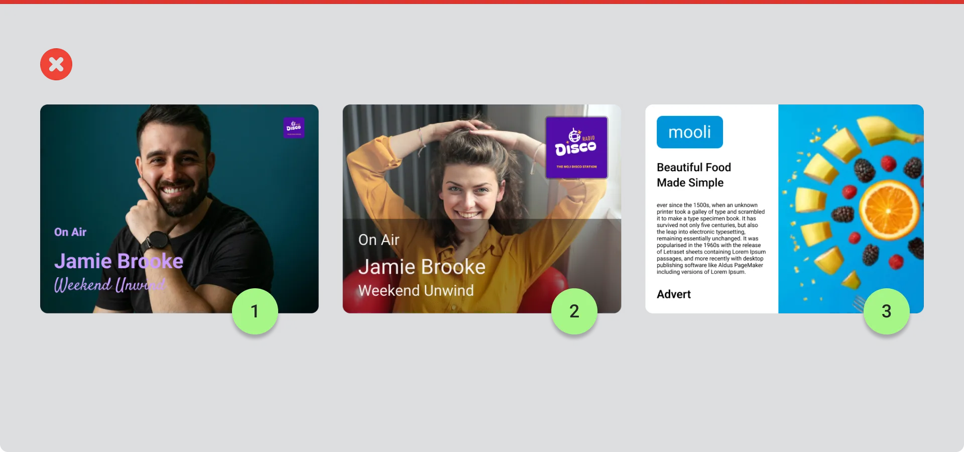
Image showing three bad examples with red crosses:
-
Script font and small logo
Decorative script font is difficult to read quickly. The station logo is too small to be recognizable at a glance. -
Insufficient panel opacity
Panel opacity at 40% doesn’t provide enough contrast. Text blends with the lighter background areas, making it hard to read. -
Pure white background with too much text
Pure white (#FFFFFF) creates glare. Body text is too small and there’s too much information to read at a glance while driving.
Design Guidelines
Section titled “Design Guidelines”Keep backgrounds simple
Section titled “Keep backgrounds simple”- If using photographic backgrounds, apply blur and a semi-transparent dark overlay (typically 40-60% opacity) between the background and any text
- For lighter photographs, use 60% opacity or higher to ensure sufficient contrast
- This removes fine detail that competes with text and increases contrast
- Use darker or lighter values behind text so it has clear separation from the background
- Avoid placing text on areas of similar brightness or color
What to avoid
Section titled “What to avoid”- Pure white (#FFFFFF) for text, backgrounds, or large areas
- Decorative or script fonts that are difficult to read quickly
- Station logos that are too small to be recognizable
- Panel opacity below 60% on lighter backgrounds
- Too much text or small body copy
- Detailed or busy backgrounds that compete with text
- Text placed directly on photographs without an overlay or panel
Keep it relevant
Section titled “Keep it relevant”Make your visual information relevant to what’s being heard right now:
- Show the current track, artist, or album art
- Display the current programme or presenter
- Feature timely promotional content
Don’t include information that’s already shown in the interface, like station name, date, time, or temperature.
Test your designs
Section titled “Test your designs”Before sending visual information:
- Verify contrast ratios meet requirements (4.5:1 minimum, 7:1 preferred) using colorcontrast.app
- Test visibility in both bright and low-light conditions
- Ensure the most important information is clear in under 2 seconds
- Check that text remains readable when the image appears at different sizes in the interface