

Multi-view Interfaces
Many drivers listen to radio while using navigation or other apps. When this happens, your radio content appears in a smaller space alongside whatever app the driver is using primarily.
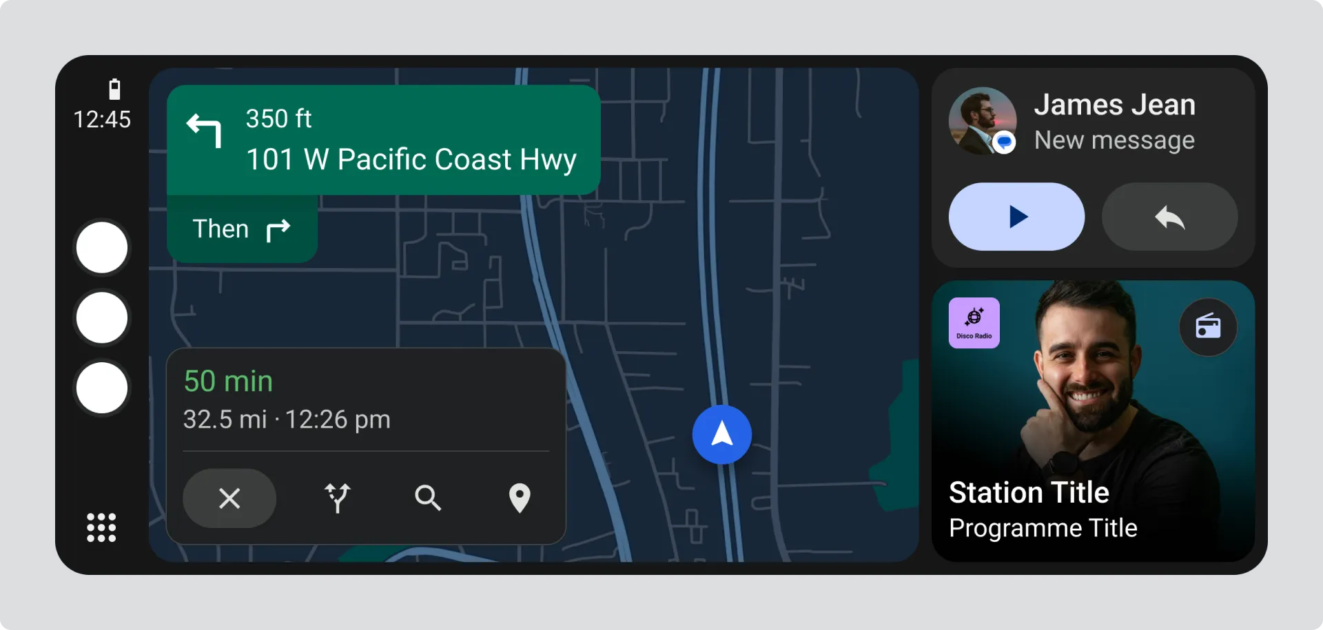
How multi-view works
Section titled “How multi-view works”The screen splits between multiple apps, typically two or three at most. Radio gets a reduced space while the driver focuses on their primary task, like navigation.
Understanding the working areas
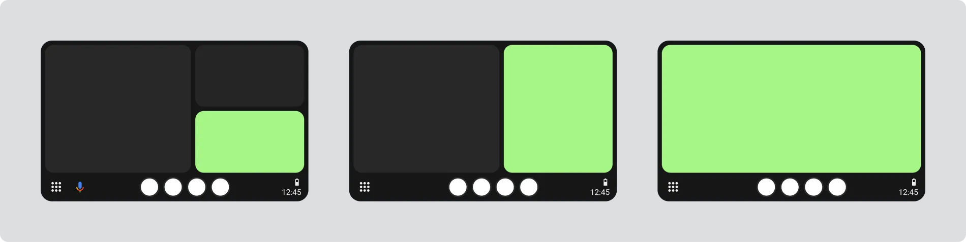
Section titled “Understanding the working areas”Image showing three different working area layouts with highlighted radio content space:
Widescreen working area
More horizontal space, but vertical space is often limited.

Horizontal working area
Radio appears in a vertical panel alongside the main app with decent space for content.
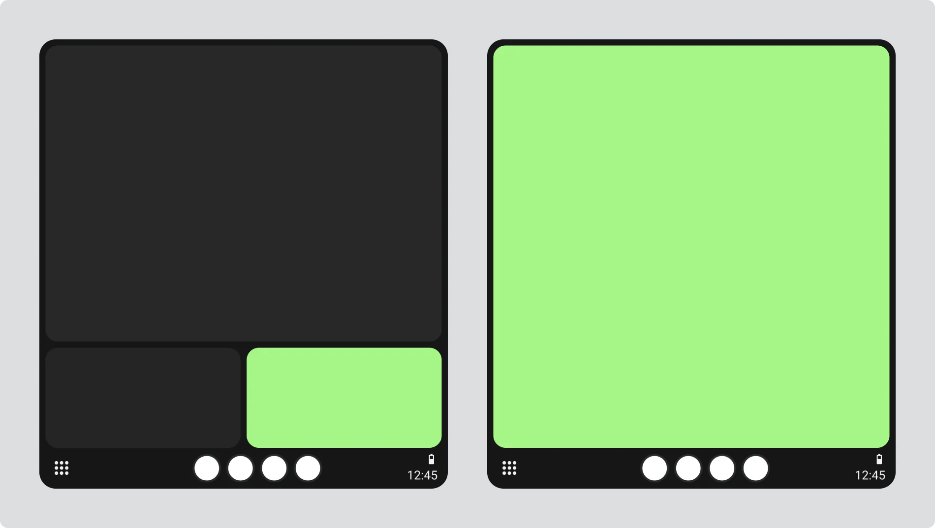
Portrait working area
Radio content appears in a compact area, typically at the bottom of the screen.
Multi-view examples
Section titled “Multi-view examples”Horizontal split
Section titled “Horizontal split”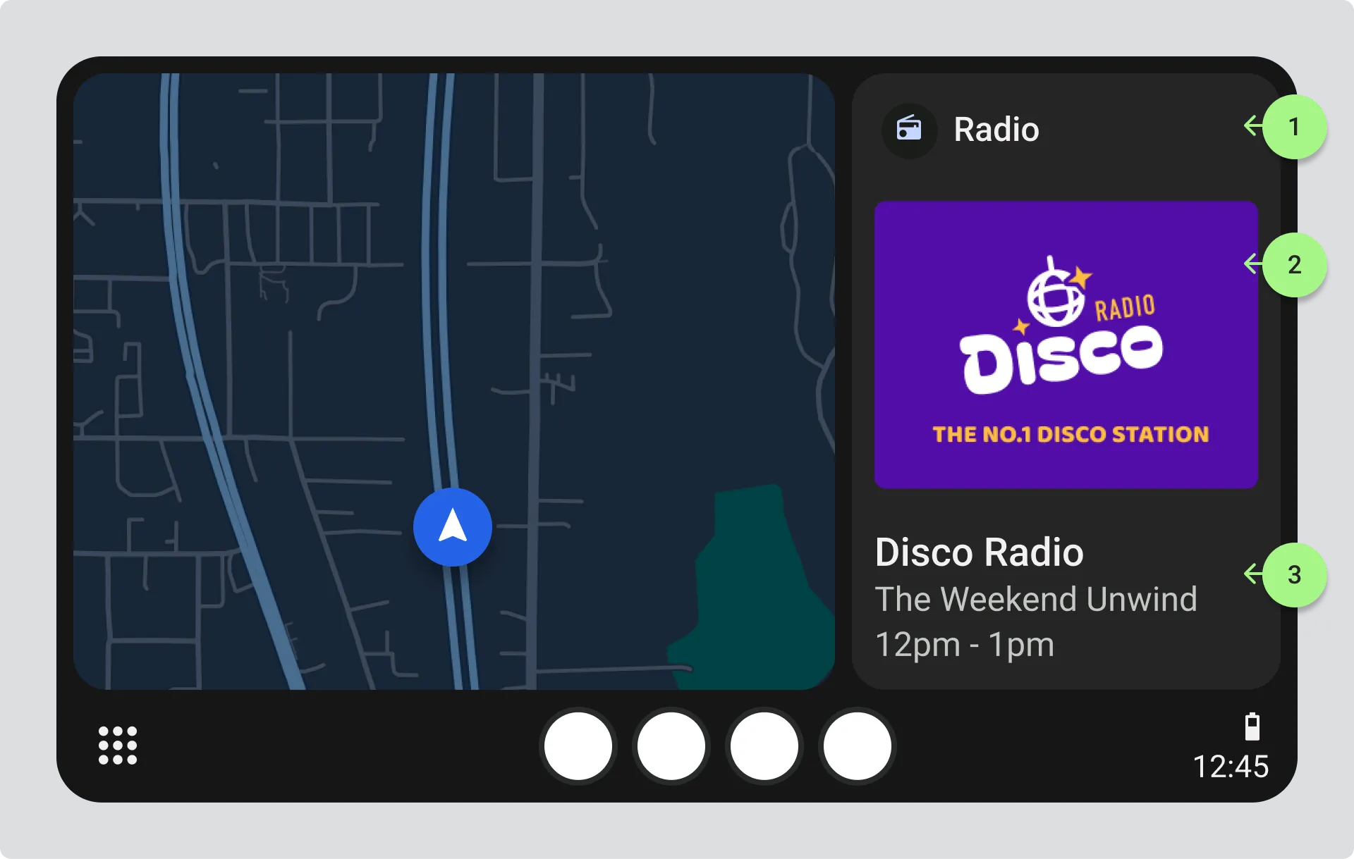
Image showing horizontal split screen with navigation on the left and radio on the right with three numbered callouts:
- Radio icon and label
- Visual information displaying station logo or programme image
- Station name, programme title, and time
In this layout, there’s enough room to show visual information at a decent size with station details underneath. Drivers can tap the icon, image, or text to open the full radio view.
Portrait compact view
Section titled “Portrait compact view”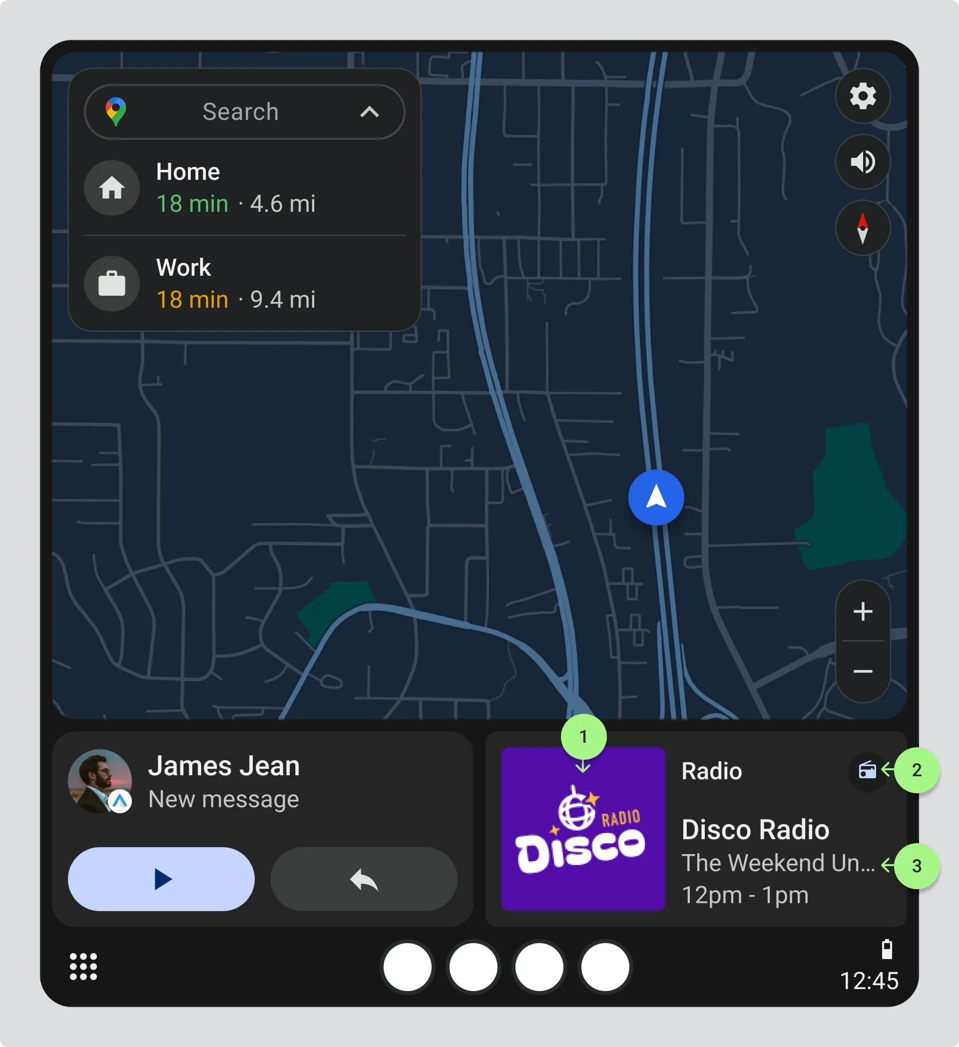 Image showing portrait layout with navigation taking most of the screen and radio in a compact bottom panel with three numbered callouts:
- Station logo at minimum 70px
- Radio icon and label
- Station name and programme title
Space is tight, so the station logo becomes the primary visual identifier. Programme information can scroll if it doesn’t fit, but station names must never scroll. Tapping any element opens the full radio view.
Information hierarchy
Section titled “Information hierarchy”Show information in this order of priority:
- Radio icon - Identifies this as the radio view
- Station logo - Minimum 70px, use the 128px thumbnail scaled down or the 320x240 medium size. Never use the favicon or rectangular logo.
- Station name - Must always be fully visible
- Programme information - Can scroll in compact layouts
- Start and end time - Only when space allows
- Visual information - Only on larger screens with room for presenter images, track images, or ads
See also: Creating Visual Information
For guidance on designing visuals that work across different screen sizes.
Text and contrast
Section titled “Text and contrast”- Minimum text size: 24px
- Station name never scrolls
- Programme information can scroll or runcate in compact layouts
- All text must meet contrast requirements of 4.5:1 minimum, 7:1 preferred
See also: Understanding contrast ratio
For detailed guidance on checking and meeting contrast requirements.
Design for compact views
Section titled “Design for compact views”What to prioritize
- Radio icon - to clearly identify the radio view
- Station thumbnail logo at minimum 70px
- Station name without scrolling
- Current programme or track that can scroll if needed
When to show visual information
- Only in larger views with adequate space
- In compact views, stick to your station logo
- Presenter images and ads won’t be readable in small spaces
Test before you launch
Section titled “Test before you launch”- Station logo at 70px
- Text at 24px with proper contrast
- Station name fully visible without scrolling
- Programme titles scrolling in compact views
- All elements tappable to open full radio view
- Visual information only appearing when there’s space
Further reading
For more on Android Automotive layouts, see Android’s media app guidelines.