Background textures and imagery
Implementing Background Patterns or Textures
Section titled “Implementing Background Patterns or Textures”Keep backgrounds secondary to foreground content. Use subtle backgrounds that do not compete with text or icons.
Best practices to maintain legibility
Section titled “Best practices to maintain legibility”- Layers: Use layering to ensure that foreground elements — such as text, icons, and controls - remain visually distinct from the background.
- Tone: Use darker or lighter values behind key information so that foreground elements have a clear luminance difference. Avoid placing text on areas of similar brightness or colour.
- Contrast: Apply a semi-transparent dark or light overlay (for example 40–60% opacity) between the background and foreground to reinforce contrast.
- Depth: Use elevation, shadow, or subtle blur to lift content layers above decorative or photographic backgrounds. Depth cues help users immediately identify what is interactive. When backgrounds are required, apply a blur and dark overlay to maintain sufficient contrast. Photographic or textured imagery can make text and icons difficult to read, especially in variable lighting conditions. To preserve legibility, the background image must be visually softened and darkened before content is placed above it.
- Test: Test legibility of all text and icons in bright, dim, and variable light conditions.
Background Imagery
Section titled “Background Imagery”When imagery is required, apply a blur and dark overlay to maintain sufficient contrast.
Photographic or textured imagery can make text and icons difficult to read, especially in variable lighting conditions.
To preserve legibility, the background image must be visually softened and darkened before content is placed above it.
- Blur: Apply a blur to remove fine detail and reduce visual noise. This prevents background texture from competing with foreground content.
- Dark overlay: Add a semi-transparent dark layer (typically 40–60% opacity) between the image and content. This lowers brightness and increases the contrast ratio between background and text.
- Testing: Verify the resulting design meets contrast requirements of at least 4.5:1 (preferably 7:1) under bright and low-light conditions.
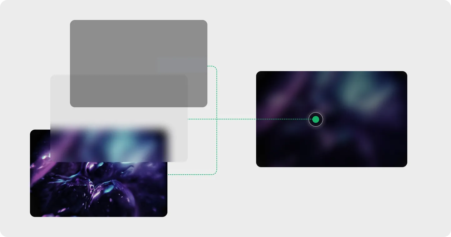
Layered Background Improve background imagery by adding blur and transparent layer to remove fine details.

Example A dark blurred background image does not interfere with content or legibility.

Example White text on a light textured background renders the content illegible.
Separation of elements
Section titled “Separation of elements”Maintain clear separation between background and content layers through tone, contrast, or depth.

Example Use spacing to seperate content from layers

Example Background image competes with the icons, text and makes the overall experience unusable.