Colour Schemes
Colour Palette and Contrast
Section titled “Colour Palette and Contrast”Dark interfaces minimise glare and support readability in varying light conditions.
- Use black or dark colours for backgrounds and layers.
- To minimise glare avoid using pure white (#FFFFFF) for backgrounds, text, or icons.
- Use light greys for text #E6E6E6 to maintain visibility without glare


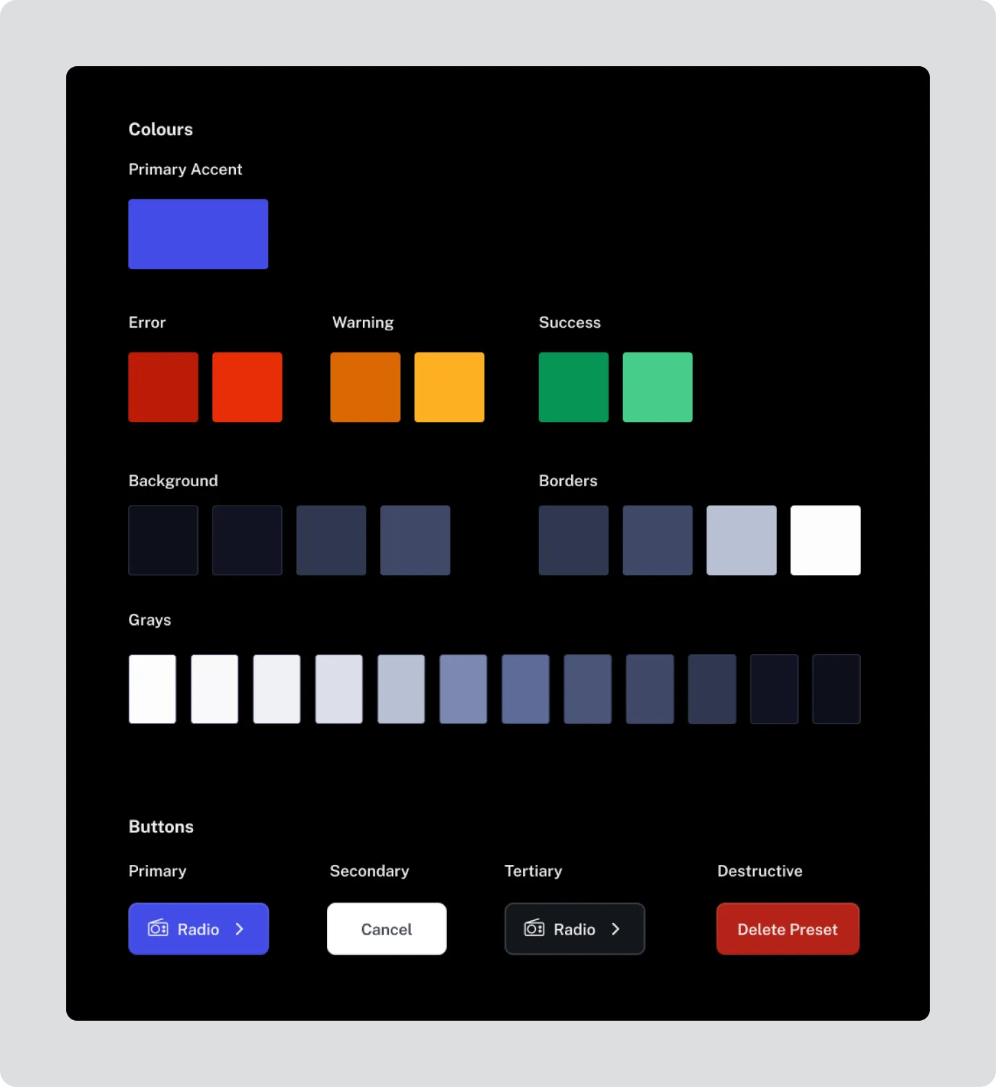
Define a consistent, restricted palette.
Section titled “Define a consistent, restricted palette.”Assign one primary accent colour for all interactive elements (links, buttons, highlights). Do not introduce multiple accent colours.
- Maintain a minimum contrast ratio of 4.5:1 for text and icons.
- Aim for 7:1 contrast for all glance-critical information.
- Verify colour contrast using recognised accessibility testing tools.
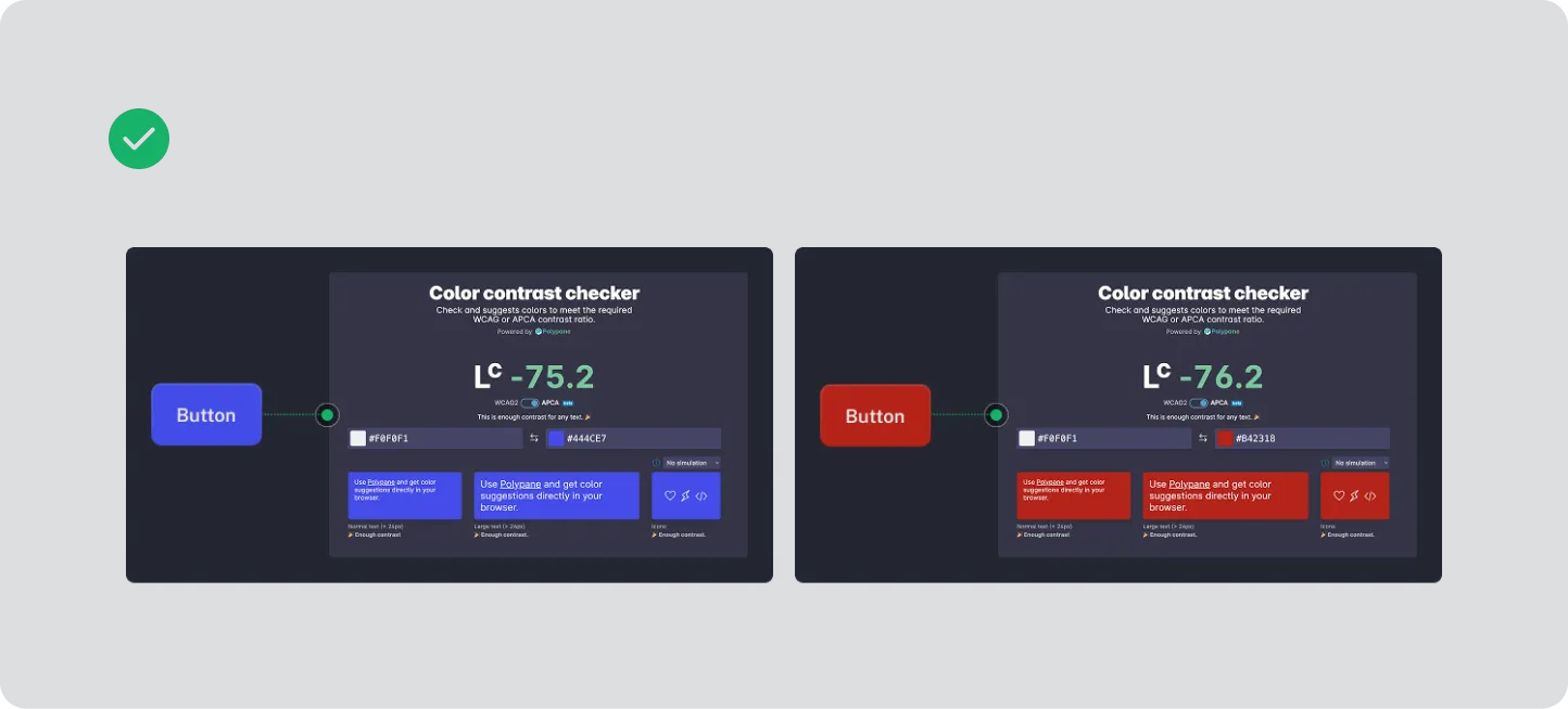
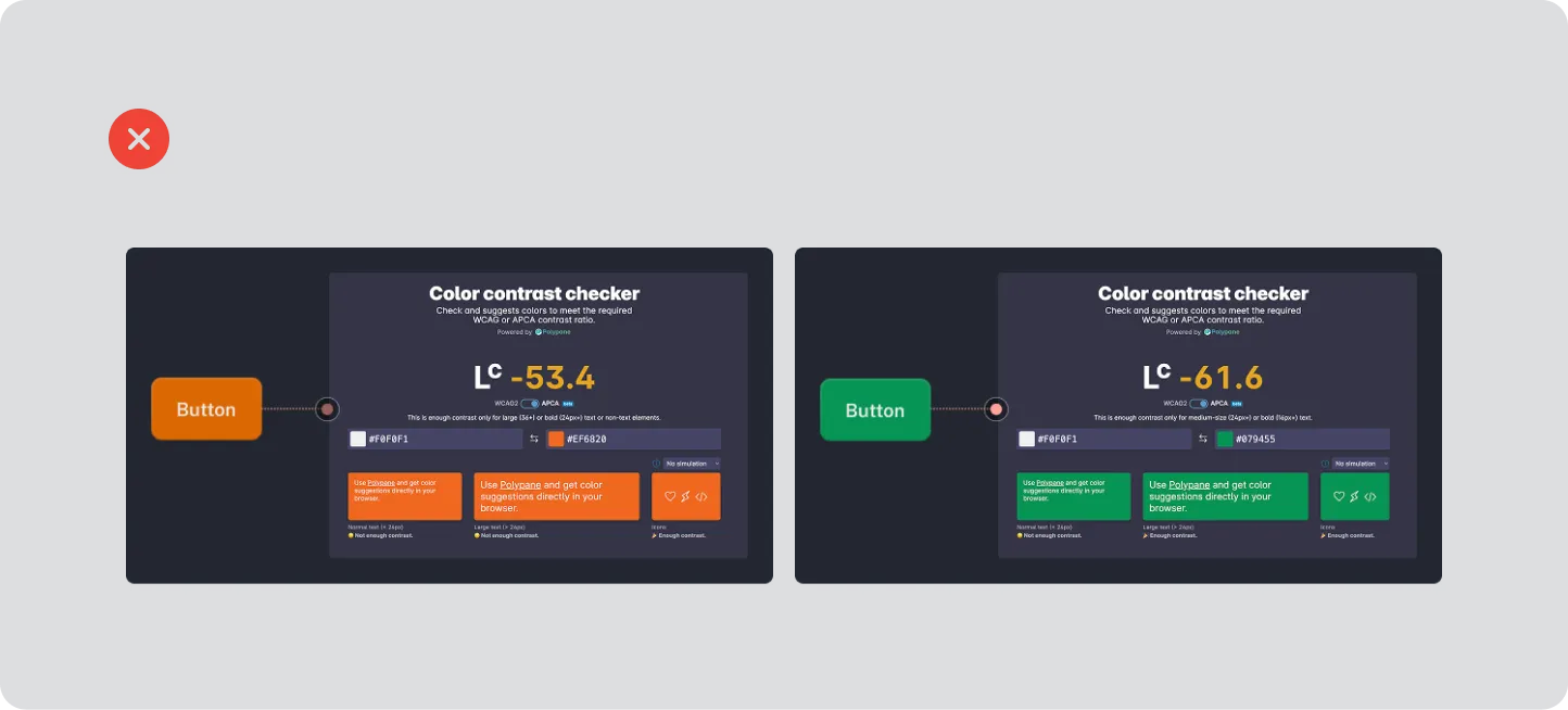
Check Colour Contrast
Section titled “Check Colour Contrast”Colour must support readability and recognition, not hinder it. Drivers interact with displays in rapidly changing lighting conditions — daylight glare, reflections, tunnels, and night-time illumination — so all colour use must prioritise legibility, contrast, and universal understanding.
Contrast Ratios
Section titled “Contrast Ratios”Colour contrast between text (or icons) and their background must meet recognised accessibility standards:
- Minimum contrast ratio: 4.5 : 1 for all body text and icons.
- Recommended contrast ratio: 7 : 1 for glance-critical information (e.g. station name, playback state, current track).
- Verify contrast using a WCAG-compliant contrast checker tool for every text–background and icon–background combination.
- Contrast requirements apply in both day mode and night mode variants.
Use of Colour for Meaning
Section titled “Use of Colour for Meaning”Colour alone must never be the only way information is conveyed.
- Supplement colour cues (e.g. “active”, “error”, “favourite”) with shape, iconography, or labels.
- Example: use both a colour highlight and a star icon to indicate a favourite station.
- This ensures the interface remains understandable for users with colour vision deficiencies
Consistent Accent Colour
Section titled “Consistent Accent Colour”Define one primary accent colour for all interactive elements such as links, buttons, and highlights.
- The accent colour must maintain accessible contrast against both background and text.
- Avoid using multiple accent hues that could confuse or dilute meaning.
- Test accent colour legibility on dark and light variants of the interface.
Colour Temperature and Glare
Section titled “Colour Temperature and Glare”Avoid using pure white (#FFFFFF) or saturated neon hues as background or accent colours.
- High-luminance colours increase glare and visual fatigue in the confined cabin environment.
- Use light greys (#E6E6E6–#BFBFBF) instead of white, and mid-tone colours for accent work.
Testing for Accessibility
Section titled “Testing for Accessibility”Test colour accessibility under real-world conditions:
- Bright sunlight: confirm text and icons remain readable and do not wash out.
- Low light: ensure sufficient separation between background and interactive elements.
- Colour vision deficiency simulation: check designs using red–green and blue–yellow filters or simulation plugins to confirm information remains perceivable.